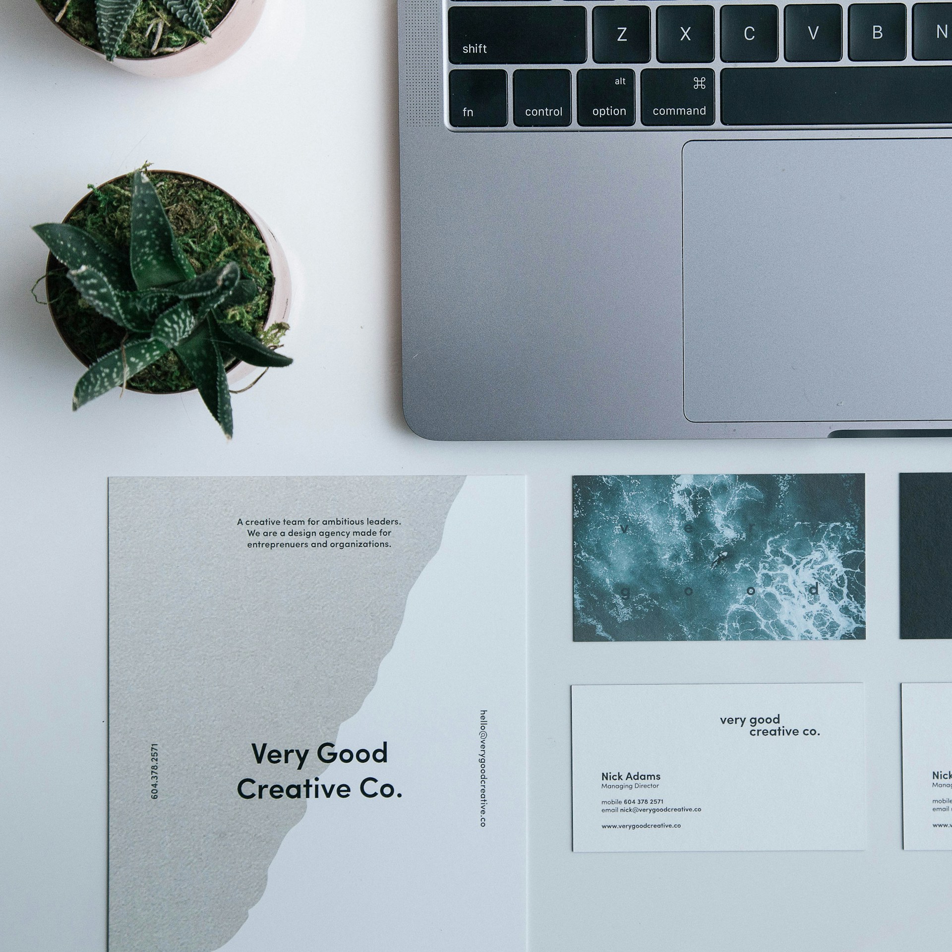
Search for “happy business card” and you’ll actually land on two very different ideas. Some people mean it literally — smiley-face, sunshine, or positive-affirmation-themed card designs. Others mean it more broadly: a business card that makes the person receiving it feel something good, so it doesn’t end up crumpled in a coat pocket or tossed in the trash before you’ve even left the room.
This guide covers both. You’ll get the psychology behind why some cards get kept and others get binned, practical design steps for building a genuinely “happy” card, real theme ideas if you want something literally cheerful, and the mistakes that quietly sabotage even well-designed cards.
Table of Contents
- What People Actually Mean by “Happy Business Card”
- Why Your Business Card’s First Impression Happens in Milliseconds
- The Uncomfortable Stat: Most Business Cards Get Thrown Away
- How to Design a Business Card That Creates a Genuinely Positive Impression
- Color Psychology for a “Happy” Business Card
- Literal Happy Business Card Ideas and Themes
- Common Mistakes That Kill an Otherwise Great Card
- Where to Design or Order One
- Frequently Asked Questions
What People Actually Mean by “Happy Business Card”
Broadly, “happy business card” searches fall into two buckets:
- Literally themed designs — cards featuring smiley faces, sunshine, bright colors, positive affirmations, or emoji-style icons, often used by coaches, wellness brands, kids’ entertainers, event planners, or anyone whose brand personality is upbeat and casual.
- Cards that create a happy reaction — the more common professional intent, where the goal isn’t a smiley icon on the card itself, but a design so well-crafted, thoughtful, or memorable that the person receiving it has a genuinely positive reaction and actually keeps it.
The second definition matters more for most businesses, because a card doesn’t need a literal smiley face to make someone happy to receive it. What it needs is to feel intentional, well-made, and a little bit different from the stack of identical cards already in that person’s pocket.
Why Your Business Card’s First Impression Happens in Milliseconds
Business cards are judged almost instantly, and mostly on things that have nothing to do with your job title. Research published in the journal Management Decision found that people form a first impression of a printed piece in roughly 90 milliseconds, and that up to 90% of that snap judgment is driven by color alone — before anyone has actually read your name or your role. Other industry research on color and branding puts that figure in a similar 62–90% range across different studies.
That’s a very short window to make someone feel good about a small rectangle of paper. It means the “happy” reaction you’re aiming for isn’t primarily created by clever copy or a witty tagline — it’s created by color, material, and layout, almost before the recipient consciously processes any text at all.
The Uncomfortable Stat: Most Business Cards Get Thrown Away
Here’s the part most articles about business cards gloss over: the average business card doesn’t survive very long. Industry data cited by business networking platforms shows that around 72% of people judge a company based on the quality of its business card, and separate research from Adobe has found that as many as 88% of business cards are thrown away within a week of being received.
That’s not a reason to give up on the medium — physical cards are still one of the few marketing tools that survive entirely outside an algorithm. It’s a reason to be deliberate. A genuinely “happy” business card is, in practical terms, one designed specifically to beat those odds: to be the card that gets pinned to a corkboard, tucked into a wallet, or photographed into someone’s contacts instead of dropped in the recycling on the walk back to the car.
How to Design a Business Card That Creates a Genuinely Positive Impression
1. Pick one or two colors that match your actual personality
Resist the urge to use every brand color you own. A card with one dominant color and a single accent reads as confident and intentional; a card with five competing colors reads as cluttered, regardless of how “happy” any individual color is meant to feel.
2. Add one small, unexpected detail
This is the detail most “memorable” cards have in common: a slightly rounded corner, a spot-UV gloss finish on one icon, a small illustration tied to what you do, or a QR code that leads somewhere genuinely useful rather than just your homepage. It doesn’t need to be expensive — it needs to be the one thing a recipient notices and mentions.
3. Prioritize legibility over cleverness
A “happy” reaction disappears fast if someone has to squint to find your phone number. Keep your name, role, and one or two contact methods in high contrast, and treat every other detail — including any playful visual element — as secondary to those.
4. Choose a card stock that matches the feeling you’re going for
Paper weight and finish communicate almost as much as the design itself. A thin, flimsy card undercuts even great graphic design; a slightly heavier stock with a soft-touch or matte finish tends to read as more considered and higher quality, which directly affects whether the card gets kept.
5. Give the recipient a reason to act, not just admire it
The happiest reaction to a business card isn’t “that’s pretty” — it’s “I want to follow up with this person.” A small, genuine call to action (a portfolio link, a discount code, an invite to a newsletter) turns a nice design into a card with a job to do.
Color Psychology for a “Happy” Business Card
Since color does most of the emotional heavy lifting in those first milliseconds, it’s worth choosing deliberately rather than by instinct. Commonly cited associations from color-psychology research on branding and print design include:
- Yellow / orange — optimism, warmth, and energy; popular for food, hospitality, children’s brands, and anything meant to feel approachable and upbeat.
- Blue — trust, calm, and reliability; the most common choice worldwide for finance, healthcare, tech, and consulting, because it signals competence more than cheerfulness.
- Green — growth, health, and sustainability; a strong fit for wellness brands, eco-focused businesses, and anything positioned around renewal.
- Red — energy, urgency, and passion; effective for grabbing attention fast, but can read as aggressive if overused across an entire card.
- Purple — creativity, luxury, and a touch of whimsy; a popular choice for coaches, creatives, and brands that want to feel a little more playful than corporate blue.
If your goal is a literally “happy,” upbeat feeling, warm colors (yellow, orange, coral) combined with plenty of white space tend to outperform darker, more corporate palettes — but they should still match the industry you’re in. A financial advisor’s “happy” card and a children’s party entertainer’s “happy” card shouldn’t look the same.
Literal Happy Business Card Ideas and Themes
If you’re specifically after the cheerful, smiley-face style of “happy business card,” these are the themes that consistently show up in real design galleries and template marketplaces:
- Smiley-face or emoji-style icons paired with bright, single-color backgrounds — common for coaches, tutors, and personal brands built around warmth and accessibility.
- Positive affirmation cards, which pair a short, encouraging phrase with clean typography — popular with therapists, wellness practitioners, and small creative businesses.
- Sunshine and pastel palettes, often used by children’s entertainers, florists, bakeries, and event planners.
- Hand-drawn or illustrated mascots, giving the card a friendly, approachable feel without relying purely on color.
- Seasonal “happy” cards — holiday- or birthday-themed business cards that double as a greeting, often used by client-facing businesses that want a reason to reconnect with past customers once a year.
These themes work best for brands where approach ability is the professional message — coaching, childcare, hospitality, wellness, and creative services. They’re a harder sell for law firms, financial services, or B2B tech, where the “happy” feeling is usually better delivered through quality and thoughtfulness rather than a literal smiley face.
Common Mistakes That Kill an Otherwise Great Card
- Too many fonts. More than two font families on one small card reads as noisy, not fun.
- Low contrast text on a bright background. A cheerful yellow card is useless if the recipient can’t read your phone number in normal light.
- Skipping proofreading. A misspelled email address or outdated phone number turns a “happy” card into a wasted print run.
- Designing the front and forgetting the back. The reverse side is free real estate — a map, a QR code, a mission statement, or extra white space for handwritten notes all outperform a blank back.
- Choosing the cheapest paper stock available. As covered above, quality signals are processed almost as fast as color; thin, flimsy stock undercuts an otherwise strong design.
- No clear next step. A card that’s purely decorative, with no QR code, portfolio link, or specific offer, is easier to forget than one that gives the recipient something to actually do.
Where to Design or Order One
For DIY design, tools like Canva and Adobe Express offer free happy/positive-themed business card templates that can be customized without design experience. For print marketplaces with existing “happy” or emotion-tagged template galleries, sites like Zazzle, DesignCrowd, and Vistaprint have dedicated categories for smiley-face, affirmation, and inspirational business cards. If you want a fully custom design tied to your brand, working with a freelance graphic designer or a small studio will typically get better results than a generic template, especially if you’re aiming for the “one small unexpected detail” approach covered above.
Frequently Asked Questions
What makes a business card “happy” rather than just colorful? A literally happy-themed card uses cheerful visual cues like smiley faces, warm colors, or positive phrases. A card that creates a happy reaction does it through quality, a thoughtful detail, and legibility — the design choices that make someone want to keep it rather than throw it away.
How much of a first impression really comes from a business card’s color? Research on print and branding suggests color alone can account for anywhere from roughly 62% to 90% of a person’s snap judgment about a printed piece, formed within about 90 milliseconds of seeing it.
Is it true most business cards get thrown away? Yes — industry research from Adobe has found that as many as 88% of business cards are discarded within a week of being handed out, and separate data shows about 72% of people judge a company based on card quality alone.
Do “happy” or smiley-themed business cards work for serious industries like finance or law? Generally, no — a literal smiley-face card can undercut credibility in trust-driven industries. Those businesses are usually better served by a card that feels “happy” through quality, thoughtful color choices (like blue or green), and a well-chosen small detail, rather than overtly playful imagery.
What’s the single highest-impact change to make a business card more memorable? Based on common design advice across the industry, it’s usually one small, unexpected physical or visual detail — a finish, a texture, an illustration, or a genuinely useful QR code — rather than adding more content or more colors.
This article is for general informational purposes and reflects publicly available design research, industry data, and print marketplace trends current as of July 2026.






Be First to Comment