Key takeaways
- The pattern: Ford, McDonald’s and Apple have kept their core logo ideas for anywhere from nearly half a century to well over a century. Each symbol grew out of something real: a building, a handwritten script, a product feature.
- The method: They change finishes, not ideas. Chrome became flat. Red-led became gold-led. Rainbow became monochrome.
- The 2026 angle: With AI tools producing endless logo options in minutes, a mark with a real origin story is harder to copy and easier to defend.
- The test for your brand: Shrink your logo to the size of a business card. If it still works, it is ready.
In 2023, Ford quietly swapped the chrome on its Blue Oval badge for a flatter blue-and-white face on the 2024 F-150. There was no press release. The company did not formally announce the update, but a senior Ford designer confirmed it to Car and Driver, which noted that the new badge was a near copy of one Ford introduced in 1965.
Two years later, a restaurant chain showed what happens when a heritage brand changes its logo loudly. Cracker Barrel unveiled a simplified, text-only mark in August 2025, dropping its familiar “Old Timer” figure and barrel. After days of backlash, and with its stock reportedly sliding, the company reversed course on August 26, saying its new logo was going away and the Old Timer would remain.
The contrast is the story of branding in 2026. Louder is not better. Older, simpler and better protected usually is.
Three symbols, one discipline
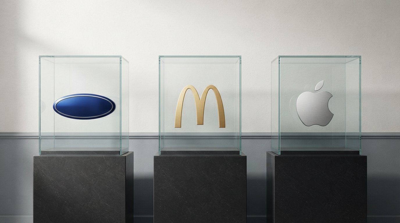
We have spent recent weeks documenting the origins of three of the most recognizable marks in business: the Golden Arches, the Ford Blue Oval, and the bitten apple. Read side by side, the three histories look less like design stories and more like operating manuals.
McDonald’s: a building became a logo
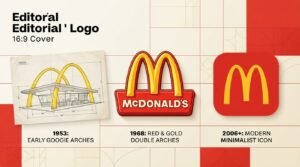
The Golden Arches began as architecture. In 1952, Richard and Maurice McDonald wanted a restaurant that could advertise itself to drivers, so they hired architect Stanley Clark Meston, who worked with assistant Charles Fish to produce two 25-foot yellow sheet-metal arches trimmed in neon. In 1962, McDonald’s head of engineering and design, Jim Schindler, converted that silhouette into a logo, and a cleaner unified “M” followed in 1968.
The company later removed the physical arches from nearly all restaurants. The logo survived anyway. In the 2018–2019 identity overhaul led by Turner Duckworth, McDonald’s made gold the lead color with red as an accent and let the arches stand alone without the wordmark. In 2026, it refreshed the McCafé identity ahead of a May beverage expansion. The idea never changed. The packaging around it did.
Ford: handwriting, a trademark and a pledge
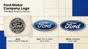
Ford’s script was drawn by C.H. Wills, an early engineer and draftsman, and Ford says it adorned cars from 1904. The name moved into an oval in 1907, and the script was registered with the U.S. Patent and Trademark Office in 1909. The Blue Oval became a vehicle badge with the Model A in the late 1920s. Ford has since moved through chrome (1976), a gradient Centennial Blue (2003) and the flatter versions of the last several years, but the script and the oval have survived all of it.
The most telling chapter came in 2006, when Ford pledged the Blue Oval as collateral for a loan package. Ford got it back after its finances recovered, and Executive Chair Bill Ford later described the pledge as putting up the company’s heritage, not just an asset. In 2026, the oval appears on F1 liveries as Ford returns to the sport, and on a new Ford Racing logo that places white “Ford” script in a solid blue oval with RACING underneath.
Apple: a bite that solved a problem
Apple’s first logo, designed by co-founder Ronald Wayne in 1976, was an intricate illustration of Isaac Newton under a tree. It was impractical to print small. In 1977, designer Rob Janoff created the bitten-apple silhouette. By Janoff’s own account, the bite was a practical fix: without it, the shape could be mistaken for a cherry or tomato at small sizes. The rainbow stripes showed off the Apple II’s color display. The logo went monochrome in 1998, and the silhouette has appeared in many finishes since.
The famous theories about the bite, from Alan Turing to the Garden of Eden, are myths. Janoff has repeatedly said he hadn’t heard of Turing when he designed it.
Side by side
| McDonald’s | Ford | Apple | |
|---|---|---|---|
| Where the symbol came from | Real roadside arches (1952–53) | Hand-lettered script by C.H. Wills (1900s) | A 1977 silhouette by Rob Janoff |
| When it became a logo | 1962 (Schindler), unified in 1968 | Name in oval 1907; Model A badge late 1920s | 1977 |
| Problem it solved | Be seen from a moving car | Feel personal and trustworthy | Read as an apple at small sizes |
| Biggest later change | Gold-led system, arches freed from wordmark | Chrome to gradient to flat | Rainbow to monochrome |
| Latest move | McCafé refresh (2026) | Flat F-150 badge, Ford Racing logo | Finishes vary by product |
| What stayed constant | The arch-shaped “M” | Script inside a blue oval | The bitten silhouette |
The 2026 argument: flat, fancy or human?
The logo world is arguing with itself. After a decade of flat, minimal, app-icon branding, several 2026 trend roundups say design is swinging toward chunkier typefaces, asymmetry and texture. Shopify’s logo coverage describes a reaction against minimalism. Creative Bloq expects brands to tweak logos and update their visual language rather than rebrand from top to bottom. And a design-industry roundup citing Deloitte Digital’s 2026 marketing analysis ties a rising premium on authenticity to the spread of AI-generated content: when everything looks generated, handmade cues stand out.
Treat those as directional, not gospel. What the big three show is a third way. Ford went flatter, but kept the script. McDonald’s went gold-first, but kept the arches. Apple has kept shifting finishes, but not the silhouette. In each case the idea is the asset, and the style is a coat of paint.
Cracker Barrel is the cautionary version. Its minimalist logo may have solved real problems on screens, but it removed the character that made the brand feel human. As one design commentary put it, simplification can fix customer problems and also erase what makes a brand feel alive. Simplify the execution, not the soul.
What AI changes, and what it doesn’t
This section is our analysis, not reporting.
AI logo generators have made it trivial to produce dozens of professional-looking marks in an afternoon. That is genuinely useful: it lowers the cost of getting started and gives founders a faster way to explore directions. Our own guides cover the field, including how to create a logo with AI in minutes, a roundup of the best AI tools for branding, and a comparison of the billion-dollar AI design tools.
But speed has a side effect: sameness. When thousands of businesses start from similar prompts and similar templates, logos converge. The three companies above suggest what to do about it:
- Start from something real. Arches built into a building. A script drawn from handwriting. A bite that fixed a legibility problem. A generator can draft shapes, but only you know your origin story.
- Solve one concrete problem. Every famous mark above answered a practical question, not a stylistic one.
- Protect what you build. Ford registered its script in 1909, and Apple’s decades of trademark disputes with The Beatles’ Apple Corps are a reminder that identity is a legal asset. If you use AI imagery in a logo, read our explainer on whether AI-generated images are copyright free first. This is general information, not legal advice.
The business card test
The smallest stage is often the most honest one. A business card is roughly the size of a favicon with a handshake attached. If your logo cannot survive there, it will struggle everywhere else.
Our guide to AI business card makers covers the tools; here is the quick test to run before you print:
| Test | What to check | Why it matters |
|---|---|---|
| Small-size | Does it read at about an inch wide? | Cards, favicons and app icons are all tiny |
| One-color | Does it work in black or a single ink? | Many print jobs and stamps use one color |
| Reversed | Does it work white-on-dark? | Dark card stocks and dark mode |
| No-name | Is it recognizable without the company name? | The Golden Arches and the bitten apple do this |
| Print-ready | Is the file 300 DPI with proper bleed (commonly 0.125 inch)? | Avoids cropped or blurry cards |
If you pass all five, you have something the big three would recognize: a mark built to work first and look good second.
A six-rule playbook
- Anchor the symbol in a real story. Architecture, craft, product, place.
- Reduce until it breaks, then add one thing back. Apple’s bite is the textbook example.
- Choose two colors and commit. McDonald’s gold and red, Ford’s blue and white.
- Change the finish, not the idea. Chrome, gradient and flat are all fine. Replacing the symbol is not.
- Register early. Ford’s script was registered in 1909.
- Test on the smallest surface first. If it works on a card, it works.
Frequently asked questions
Why do big brands rarely change their logos?
Because the logo is stored recognition. Changing the idea throws that away, while updating the finish keeps it. Ford, McDonald’s and Apple have all kept their core symbols while changing colors, effects and typography.
Has Ford changed its logo recently?
Subtly. The 2024 F-150 introduced a flatter blue-and-white badge, and Ford refined a flat version for digital use in the late 2010s. The script and oval have not been replaced.
Did McDonald’s change the Golden Arches in 2026?
We found no official change to the main logo. McDonald’s refreshed the McCafé visual identity in 2026, with a refined gold and coffee-cherry-inspired palette.
Why does the Apple logo have a bite?
According to designer Rob Janoff, the bite was added so the silhouette would read as an apple, not a cherry or tomato, at small sizes. The Alan Turing story is a popular myth.
What happened with Cracker Barrel’s logo?
In August 2025, Cracker Barrel unveiled a simplified, text-only logo, faced a fierce backlash, and reversed course within days, restoring its “Old Timer” illustration.
Should a small business copy a famous logo style?
Copy the discipline, not the shapes. Start from your own story, simplify, and test at small sizes. Avoid look-alike designs that could invite trademark trouble.
Is it safe to design a logo with AI?
It can be a good starting point, but check the tool’s commercial-use terms, search for similar existing marks, and consider professional trademark advice before you commit.
How we reported this
This article draws on company heritage material and primary reporting where available, including Ford’s own account of its Blue Oval history and Associated Press coverage of the Ford Racing rebrand, plus contemporaneous news coverage of the Cracker Barrel reversal and design-industry reporting on 2026 logo trends. Details that vary by source, such as the exact year the first Blue Oval appeared on a Model A (1927 or 1928) and the date of Ford’s flat badge (2017, 2019 or 2024 depending on what you count), are noted where they matter. This piece is analysis and commentary built on public records; we did not interview the companies mentioned. Corrections are welcome at the contact page.
Related reading on LA Tech Post
- McDonald’s Logo: Who Designed the Golden Arches and How They Changed
- Ford Motor Company Logo: The Blue Oval’s History, Designer, Meaning, Colors and Font
- Logos With Apples: The Complete Story Behind Every Iconic Apple Symbol
- 7 Best AI Business Card Maker Tools for 2026
- Create a Logo With AI in Minutes: 7 Brand Design Tools to Try in 2026
Sources
- Ford Motor Company (@FordOnline): “TBT: How the Blue Oval Beat Out Other Logos to Represent Ford Motor Company” (September 2023)
- Associated Press: “Ford Racing: A new era for America’s race team”
- Ford: “Ford returns to Formula 1 racing” (January 2026)
- Car and Driver, via Yahoo Autos: “Ford just updated its logo for the first time in decades” (2023)
- Wikipedia: Golden Arches; Wallpaper*: “The story of McDonald’s legendary logo by Jim Schindler”
- It’s Nice That: “Behind the McDonald’s redesign” (July 2019); McDonald’s Corporate: McCafé visual identity refresh (2026)
- ABC News, CBS News and Entrepreneur: coverage of Cracker Barrel’s August 2025 logo reversal
- Creative Bloq, Shopify and Inkbot Design: 2026 logo design trend analyses




[…] card or a favicon. Our guide to AI business card makers covers tools for that, and our piece on how Ford, McDonald’s and Apple protect their logos explains why small-size testing […]