If you’ve ever tried to pick an AI logo maker, you know the paradox: every platform promises “instant, professional logos,” but the actual experience of using them can be wildly different. Some hand you a handful of options in seconds. Others walk you through a whole interview before showing you anything.
So which approach actually gets you closer to a logo you’d be proud to slap on a business card? To find out, I ran the same brief through three of the biggest names in the space: Design.com, Canva, and Looka. I also used a fictional esports company as the test case: Ironclad Gaming.
Here’s the brief I gave each platform (where the platform allowed a written prompt):
Create a bold, modern logo for a competitive gaming and esports company called Ironclad Gaming. The brand targets gamers, streamers, esports fans, and aspiring competitive players. Use strong typography, an identifiable icon, and a dark color palette with a bright accent color.
The short version: Design.com came out on top as the best logo maker. It generated over 10,000 relevant logo concepts, understood the brief without needing a questionnaire, and kept producing usable ideas even 200+ pages deep. Canva was the fastest, but its four concepts all leaned on the same tired armored-helmet cliché. Looka’s guided setup was thoughtful, but the payoff — 23 fairly generic icon-and-wordmark combos — didn’t match the time invested.
Let’s get into how each one actually performed.
The quick verdict
| Logo maker | Best for | Main strength | Main limitation |
| Design.com | Small businesses building a complete brand | 10,000+ relevant results with real visual variety | Collaboration tools are lighter than Canva’s |
| Canva | Freelancers & content creators | Fast, prompt-based generation + a flexible editor | Only 4 initial concepts, with little variation |
| Looka | People who want to be guided | Step-by-step preference selection | Long setup, but fairly generic results |
How the logo makers were evaluated
Below are the five things that actually matter when you’re starting a brand like Ironclad Gaming from scratch:
- How easy it is to get going
- How well the platform understood the Ironclad Gaming brief
- The quantity and variety of what it generated
- How finished the results actually looked
- Whether the platform helps you build a brand after the logo
I used the same company name and creative direction everywhere a written prompt was possible. Looka doesn’t work that way, so I matched its questionnaire as closely as I could to the same industry, style, colors, and symbols.
That difference in workflow is worth calling out early because a logo maker’s job is to translate a business idea into the right visual direction without piling on extra work for you.
Round 1: Which one is easiest to actually start using?
Canva got me to four concepts fastest. I typed the prompt, hit generate, and had four logos in one step — no questionnaire, no color-picking, no symbol selection first. If you already know exactly what you want, that’s genuinely satisfying.
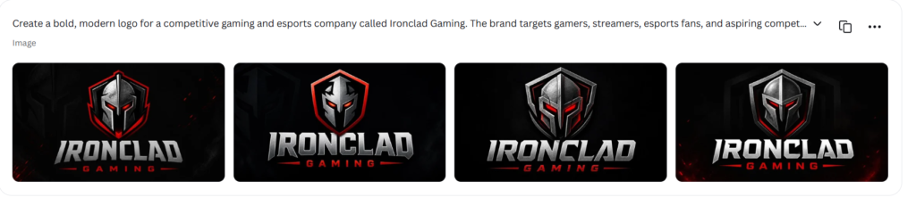
The catch: all four concepts followed almost the exact same formula, a metallic helmet or shield, big silver lettering, red highlights, dark background. They looked cohesive and undeniably “gaming,” but they read more like four tweaks on one idea than four real directions to choose between.
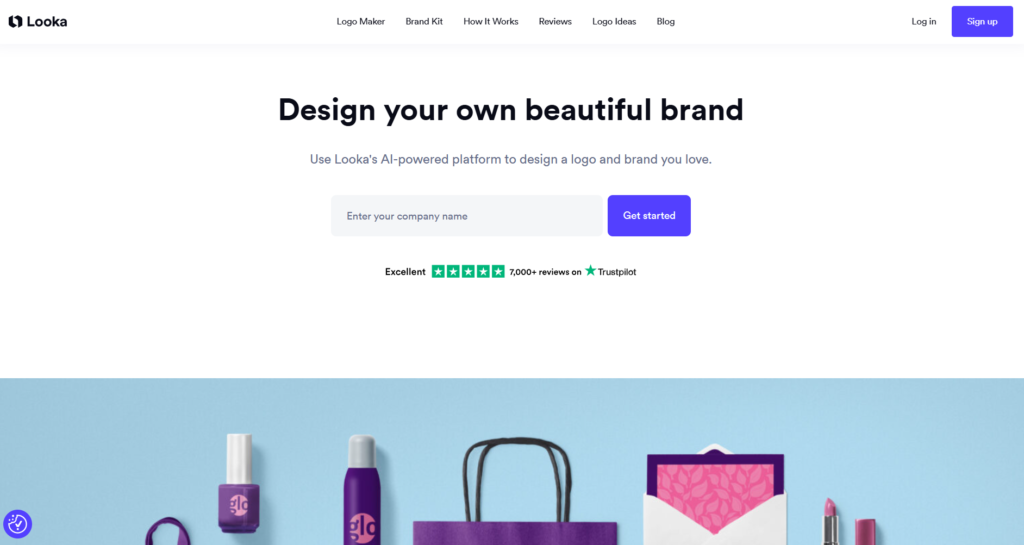
Looka took the long way around, walking me through six stages: business name, industry, example logos I liked, colors, name/slogan confirmation, and symbol choice before generating anything. That’s genuinely helpful if you’re not sure how to describe your own visual identity out loud. Most steps can be skipped, too. Here are some samples:
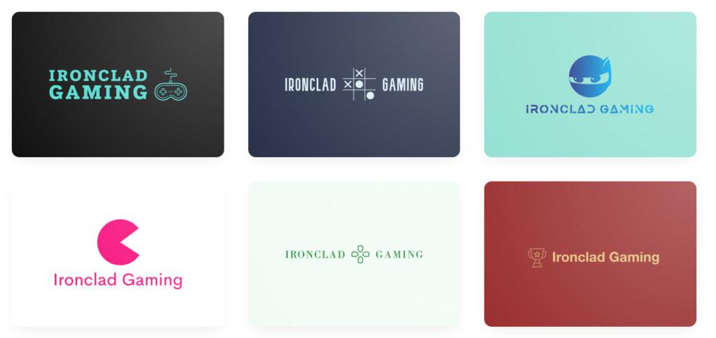
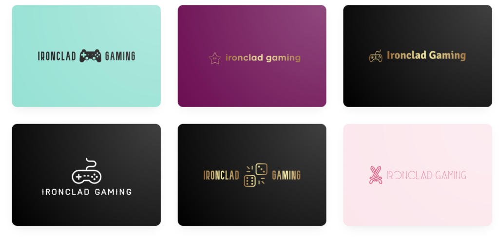
The tradeoff is time. All that setup produced an initial batch of 23 logos, and a lot of them were pretty basic pairings of a gaming symbol with the company name. It wasn’t exactly proportional to the effort.
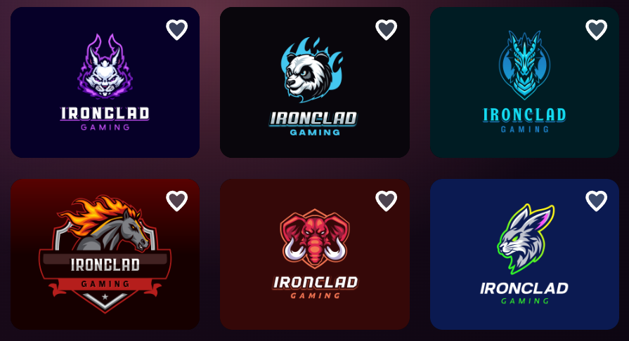
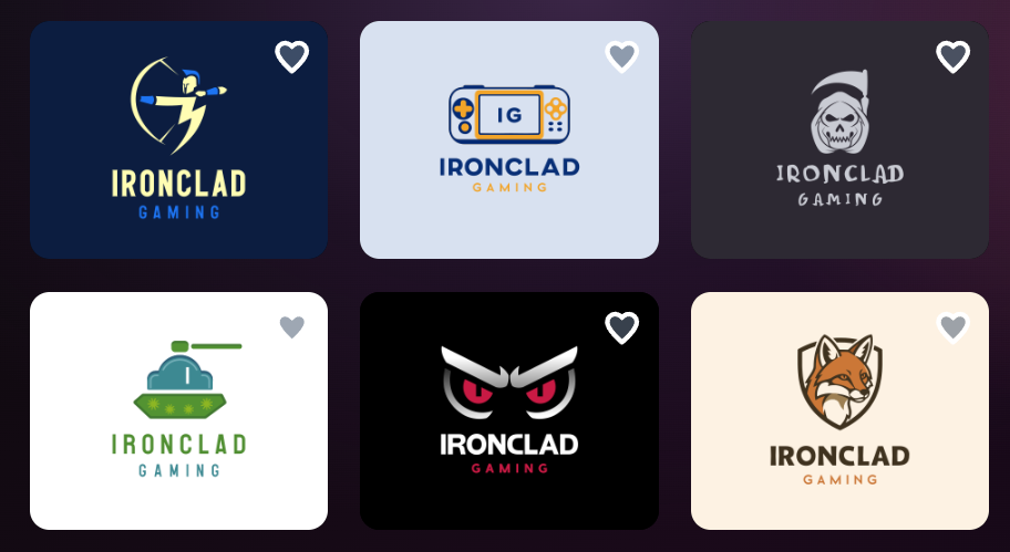
Design.com’s AI logo maker skipped the interview entirely. It pulled its own keywords straight from the brief and returned results in seconds. There wasn’t a drawn-out preference sequence I had to go through. It managed to combine Canva’s speed with a genuinely large, relevant set of options to actually browse. Here’s what the logos looked like:
Winner: Design.com. Canva technically took fewer clicks, but Design.com struck the better balance between “fast” and “actually gives me something to work with.”
Round 2: Who generates the most (usable) options?
This is where the gap became impossible to ignore.
| Platform | Initial output | Can you see more? | Result |
| Design.com | 10,000+ logos | Yes — across 211 pages | Largest selection, by far |
| Canva | 4 concepts | Not in the initial pass | Smallest selection |
| Looka | 23 logos | Yes, via “show more” | Moderate selection |
Canva’s four options are enough to test one direction, but not enough to actually explore what Ironclad Gaming could be. If that armored-knight look wasn’t the vibe, there was nowhere else to go from the initial results.
Compared to Canva, Looka gave more to work with, but a lot of it leaned on the same familiar gaming props like controllers, joysticks, and headsets, dressed up in different colors and fonts. The variety was more surface-level than structural.
Design.com returned 10,096 results spread across 211 pages with around 40+ logos per page, and the quality didn’t fall off as the volume went up. This is the part that was most impressive. The first pages alone had mascots, shields, animals, abstract gaming marks, helmets, controllers, badges, and typography-driven logos. Skipped to page 211 out of curiosity, and it was still turning up relevant concepts: handheld gaming devices, armored characters, emblems, and mascot designs.
Winner: Design.com, and it isn’t close.
Round 3: Whose results actually feel different from each other?
Volume only matters if the ideas inside it are genuinely distinct.
Canva took “Ironclad” literally — every one of its four logos centered on a metal helmet or shield. Polished, on-brand for esports, sure. But choosing between them meant refining one concept, not comparing different brand identities.
Compared to Canva, Looka’s range was wider on paper: controllers, headsets, joysticks, handheld consoles, more abstract icons, and palettes running from pink and purple to blue, gold, and black. Still, a lot of the designs boiled down to the same icon-plus-name formula, and several felt more like a casual gaming channel than a competitive esports org.
Design.com covered noticeably more ground among the three platforms with animal mascots (wolves, bears, dragons, rabbits, horses), warriors and knights and skulls, shields and team badges, controllers, minimalist monograms, futuristic neon marks, circular emblems, and typography-first designs. That range matters because it gives a business room to actually decide what “Ironclad” should mean. Is it an aggressive esports team? A premium gaming studio? A creator-first community? Design.com left the door open to all of it.
Winner: Design.com.
Round 4: Which logos look the most finished?
Canva’s four logos had strong visual polish. The metallic effects and dark-and-red palette alone read “esports” instantly. But the sameness across all four undercut that polish; looking good four times over doesn’t solve a lack of choice.
Looka’s designs were clean and usable, though a fair number would need real customization to feel distinctive, and a few icons felt disconnected from the “Ironclad” name or the “bold, modern” brief.
Design.com’s strongest options already looked like finished team identities. There was solid icon work, deliberate typography, good contrast, tight compositions. A lot of them looked ready to use after minor tweaks to color or wording. And that quality held up on the last page of results too, which told me Design.com wasn’t just front-loading its best work and coasting after that.
Winner: Design.com.
What you get after the logo: feature comparison
Generating the logo is only step one. Here’s what each platform offers once you’re ready to build the rest of the brand:
| Feature | Design.com | Canva | Looka |
| Prompt-based generation | Yes | Yes | No — questionnaire-based |
| Results in this test | 10,000+ | 4 | 23+ |
| Template selection | 500,000+ templates | Part of a broader library | AI recommendations |
| AI-assisted editing | Icon + text editing via chat | General AI + manual tools | Guided editing |
| Vector formats | SVG, EPS, PDF | Depends on plan | SVG, EPS, PDF (select packages) |
| Raster formats | PNG, JPG | PNG, JPG | PNG |
| Animated formats | GIF, MP4 | Exportable animated designs | Not a core feature |
| Transparent background | Yes | Plan-dependent | Premium/Brand Kit only |
| Icon-only option | Yes | Manual | Included in purchased variations |
| Auto brand application | Yes | Yes | Yes (Brand Kit) |
| Website builder | Yes | Yes | Brand Kit Web subscription |
| Collaboration | Lightweight | Strong | Limited |
| Best use case | Logo-first branding | Ongoing content creation | Guided logo + brand kit |
Canva is still the most flexible general-purpose design environment out there — no argument. But Design.com does something different well: it connects the logo directly to everything built around it, letting templates automatically inherit your logo’s colors for business cards, social graphics, flyers, and more. Looka’s Brand Kit (300+ branded assets) does something similar, just on a smaller scale.
What it actually costs
| Platform | Free access | Entry paid option | Other tiers |
| Design.com | Free logos + select branding tools | Starter: $3/mo annually (or $9/mo) | Value: $4/mo; Premium: $5/mo |
| Canva | Free plan with logo creation | Varies by plan/region | Pro, Business, Enterprise |
| Looka | Free to create, edit, preview | Basic logo: $20 one-time | Premium: $65; Brand Kit: $96/yr; Brand Kit Web: $129/yr |
A couple of things worth knowing before you commit: Design.com’s Starter plan includes high-res and vector files, unlimited logo changes, business cards, social posts, email signatures, and 50+ design tools. The Value and Premium tiers layer on a website and a link-in-bio page. Looka’s $20 Basic package, by contrast, only gets you a single PNG — the vector files, transparent versions, and lifetime support live behind the $65 Premium tier.
So, who should actually use which one?
New to logo design? Go with Design.com. It clears away most of the early friction — start from a written brief, browse thousands of relevant directions, and pick something that already looks close to finished. Yes, the sheer volume can feel like a lot, but the auto-generated keywords and favoriting make it easy to narrow down without getting stuck on one idea.
Freelancer or content creator? Canva still makes sense. If you’re already living inside Canva for thumbnails, social posts, and presentations, its collaborative editor and content ecosystem are hard to beat for everyday flexibility — even if its logo generation alone felt thin in this test.
Want to be walked through it step by step? Looka fits. If you don’t have a creative brief written out and want the platform to ask the questions for you, its guided flow is genuinely useful — just know the tradeoff is more conventional output.
Running a gaming or esports brand specifically? Design.com again. Its logos extend naturally into social graphics, merch, business cards, and websites, and the format options. It offers transparent PNGs for streaming overlays, vectors for jerseys and print and covers the bases a gaming brand actually needs.
Bottom line
Design.com was the clear winner across this test. It generated 10,096 logos in seconds, understood the brief without hand-holding, and kept the quality consistent all the way. Canva’s speed is real, but four near-identical concepts weren’t enough to explore what Ironclad Gaming could become. Looka’s guided approach is thoughtful, but the extra time mostly bought more conventional results.
If you’re starting from an idea and want to end up with a logo, and eventually a full brand, without getting boxed into one creative direction too early, Design.com is your best bet.







Be First to Comment