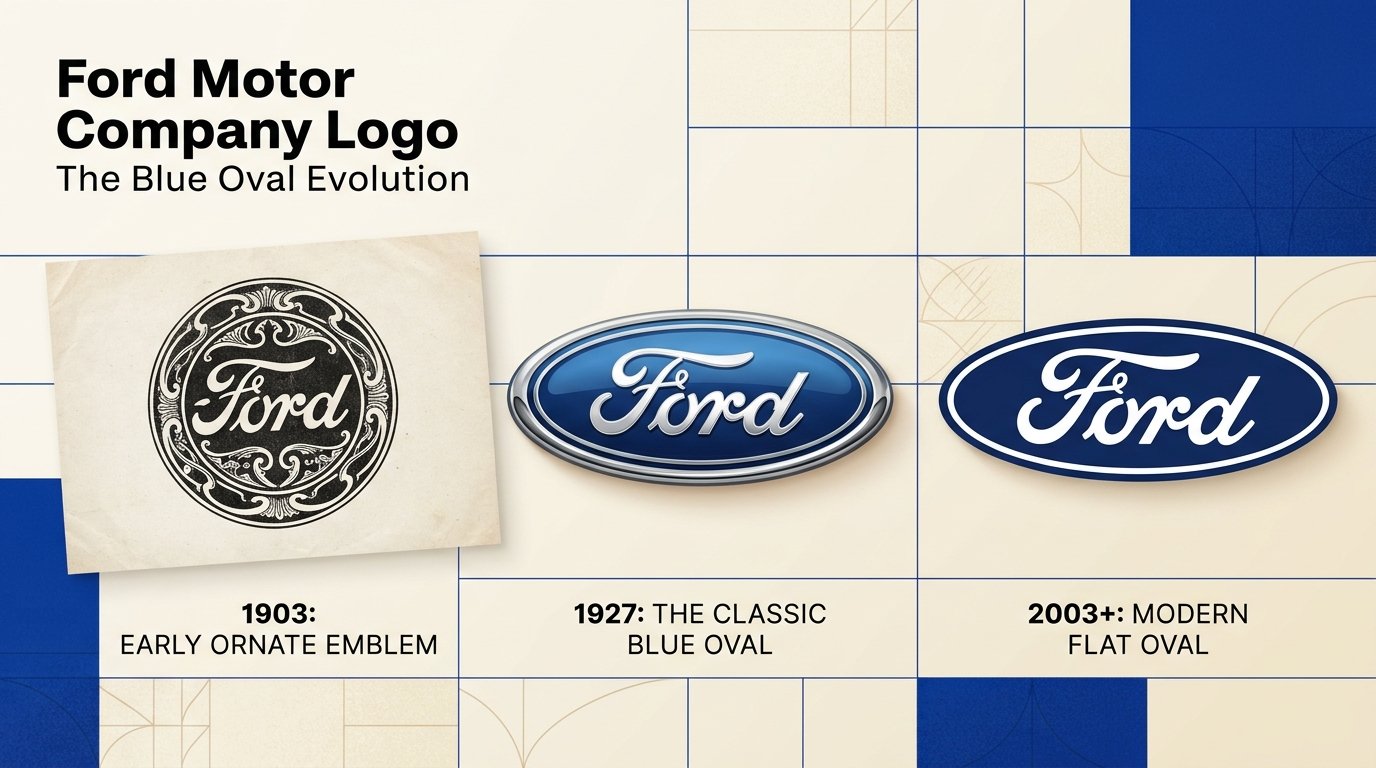
Quick answer: The Ford Motor Company logo is the Blue Oval: the word “Ford” in white cursive script inside a blue oval. The script was drawn by early Ford engineer and draftsman Childe Harold Wills and has been in use since the company’s first years (Ford says it adorned cars from 1904). Ford first put the name inside an oval in 1907, and the Blue Oval began appearing on cars with the Model A in the late 1920s. The brand color is a deep blue, commonly listed as #003478, and Ford’s script was registered as a trademark in 1909.
Fast facts: the Ford logo at a glance
| Question | Short answer |
|---|---|
| What is the logo called? | The Blue Oval |
| What does it look like? | White cursive “Ford” script on a blue oval |
| Who designed the script? | Childe Harold (C.H.) Wills, Ford’s early engineer and draftsman |
| Is it Henry Ford’s signature? | No. It is Wills’ lettering, not Henry Ford’s autograph |
| When did the name first appear in an oval? | 1907 (Ford’s own account) |
| When did the Blue Oval reach cars? | The Model A, late 1920s (Ford dates it to 1928; many sources say 1927) |
| Script registered as a trademark | 1909 |
| Brand color | Ford Blue, commonly listed as #003478 (Pantone 287 C) |
| Brand typeface | Ford Antenna (reported) |
| Latest big change | A flatter, simpler badge, first widely seen on the 2024 F-150 |
What does the Ford logo look like?
The Ford logo is a horizontal blue oval with the word “Ford” in flowing white script. The letters lean forward, the “F” has a distinctive looped flourish, and the whole thing reads as friendly rather than corporate. The modern version is flatter than the chrome-edged badges of the 1970s through the 2000s: a solid blue field and white lettering with a simple white border.
It appears on vehicles, dealership signs, race cars, tools and parts, which is why it is one of the most recognized automotive marks on earth.
The story: a script, a pyramid with wings, and a trophy oval
The Ford logo is unusual because its two halves have different birthdays. The script came first. The oval was added later, then lost, then brought back.
1903–1907: An ornate emblem, then Wills’ script
Ford Motor Company was founded in Detroit in 1903. According to Ford’s own heritage account, the first emblem on the Model C was ornate and included the company’s hometown of Detroit. Ford credits C.H. Wills, an engineer and draftsman with a typography background, with the script that followed. It adorned Ford models from the Model C in 1904 through the last Model T in 1927.
A more stylized version, nicknamed the “script with wings,” appeared on all Ford cars in 1906.
1907: The name enters the oval
Ford says the Ford name didn’t make it into an oval until 1907, four years after the company’s founding. Separately, design historians note the oval first appeared in British advertising by Ford’s agents in that period, and one Ford historian has described the early shape as closer to a football than a clean ellipse.
1909: The script becomes a registered trademark
Ford’s script was registered with the U.S. Patent and Trademark Office in 1909, an early example of a company protecting a hand-drawn wordmark as brand property.
1909–1912: The Universal Car logo
Ford also used a winged triangle in advertising from 1909 to 1912. The pyramid base was meant to suggest strength and stability; the wings, speed and lightness. It never replaced the script and faded out.
1927–1928: The Model A and the Blue Oval
The oval became a real automotive badge with the Model A. Ford dates the script-in-oval on the car’s radiator to 1928, while many other sources say 1927, the year the Model A was introduced. The oval was set on a deep blue background. Design commentators say the shape suited the radiator and signaled dependability.
1938–1982: Back to the script
Ford reverted to the script in 1938. The oval did not return as an exterior vehicle logo until 1982. From the 1950s to the late 1960s, Ford cars also wore a red, white and blue coat of arms derived from an 18th-century English design. By the 1970s the Ford name sometimes appeared in block letters, and Thunderbird and Mustang had their own model-specific logos.
1961: The oval represents the whole company
It was not until 1961 that the Blue Oval began to identify the company itself, not just its products.
Mid-1960s: A famous “no”
Reports describe designer Paul Rand proposing a more modernist rectangular redesign in the 1960s that Henry Ford II rejected in favor of keeping the Blue Oval. Treat the details as widely repeated design lore rather than a primary-source fact.
1976: The chrome Blue Oval
Ford modernized the badge with a three-dimensional look that imitated a real chrome-and-enamel vehicle emblem, and thickened and tweaked the script. This is the version most people over 30 picture.
Early 2000s: The “Ford Motor Company” script
Around the turn of the millennium, the Ford Motor Company script was set up as the company’s trust mark, while vehicle badges stayed the same.
2003: The Centennial Blue Oval
For Ford’s 100th anniversary, the company introduced a dimensional Blue Oval with a brighter “Centennial Blue” gradient, and the oval returned to the facade of Ford’s world headquarters.
2006–2012: The oval as collateral
In 2006, while under financial pressure, Ford pledged the Blue Oval, along with the F-150 and Mustang trademarks and other assets, as collateral for a loan package. After Ford’s stock returned to investment grade, the company got them back. Bill Ford later described the pledge as putting up the company’s heritage, not just an asset.
Late 2010s–2024: Flat, simple, digital-first
Ford refined the oval in 2019 with a flat blue inside, per its own heritage article. Other sources date a flat version to 2017. On vehicles, the biggest visible change was the 2024 F-150, whose badge dropped the chrome for a flatter blue-and-white face. Ford didn’t formally announce it, but a Ford senior designer confirmed the change to Car and Driver. Car and Driver noted the new badge was a near copy of the one Ford introduced in 1965.
2025–2026: Sub-brands and racing
Ford rebranded its motorsports arm as Ford Racing, with a logo of white “Ford” in a solid blue oval and the word RACING in bold blue beneath. Ford also returned to Formula 1 in 2026, with the Blue Oval on its partner team liveries. In Brazil, Ford refreshed the Motorcraft parts logo in 2026 to feature the Blue Oval more prominently. The core logo itself has not been replaced.
Ford logo timeline (table)
| Year | Change | Detail |
|---|---|---|
| 1903 | Founding | Ornate emblem on the Model C, with Detroit |
| 1904 | Wills script | Used from the Model C through the last Model T (1927) |
| 1906 | “Script with wings” | More stylized script on all Ford cars |
| 1907 | Name in an oval | Four years after the company was founded |
| 1909 | Trademark | Ford script registered with the USPTO |
| 1909–1912 | Universal Car logo | Winged triangle in advertising |
| 1927–1928 | Model A | First Blue Oval on a car (date varies by source) |
| 1938 | Back to script | Oval dropped from vehicles |
| 1961 | Company mark | Blue Oval identifies Ford Motor Company |
| 1976 | Chrome oval | Three-dimensional, thicker script |
| 1982 | Oval returns | Back as an exterior vehicle logo |
| 2003 | Centennial Blue Oval | Brighter blue gradient for the 100th anniversary |
| 2019 | Flat blue | Ford’s heritage article dates the flat refinement here |
| 2024 | New F-150 badge | Flatter blue and white, chrome dropped |
| 2026 | Racing and F1 | Ford Racing logo and the Blue Oval on F1 liveries |
Who designed the Ford logo?
Childe Harold Wills, usually called C.H. Wills, designed the Ford script. He was one of Henry Ford’s earliest associates: an engineer, draftsman and metallurgist who also played a major role in the Model T. Ford’s own account credits him with the original script.
There is a charming legend about how he did it: that he used a stencil set left over from a family business, with the lettering style based on the penmanship taught in schools when he and Henry Ford were children. Sources disagree on whether the stencils belonged to his grandfather or his father, and the details are folklore. What is solid is the credit to Wills and the fact that the script grew from the ornate handwriting of the era.
The flowing style belongs to the same Spencerian-influenced tradition that gave the world other famous scripts, which helps explain why Ford’s lettering feels familiar even if you’ve never looked at it closely.
What does the Ford logo mean?
There’s no official secret code, but the design says a lot:
- The script feels personal and handmade, like a signature on a promise. It tells customers a person stands behind the product.
- The oval works like a seal or a badge: contained, stable and easy to put on a grille.
- The blue signals trust and reliability, which is why the Blue Oval is also the way people refer to the company itself.
- The consistency is the real message. Ford has changed finishes, not the idea, for roughly a century.
That staying power is why “Blue Oval” works as a nickname for the whole company and its fans.
Ford logo colors
| Element | Color | Notes |
|---|---|---|
| Oval | Ford Blue #003478 | Widely referenced value (Pantone 287 C) |
| Script and border | White #FFFFFF | Flat modern versions |
| Older badges | Chrome or silver edging | 1976–2003 era |
Ford has used different blues across eras, including the brighter 2003 Centennial Blue. If you need an exact match for print or signage, work from Ford’s own current brand files rather than a hex code from a third-party site.
What font does the Ford logo use?
None. The Ford script is custom lettering, not a font you can install. For Ford’s modern marketing and text, the brand typeface is reported to be Ford Antenna, a custom family associated with type designer Greg Highsmith. If you want a vibe that resembles the Ford script, look at vintage Spencerian-style scripts, but remember the logo itself is a protected trademark.
Ford’s logo family: which logo is which?
| Logo | What it is |
|---|---|
| Ford Blue Oval | The main emblem on vehicles and company materials |
| Ford Motor Company script | The corporate trust mark used in the early 2000s |
| Ford Racing | White “Ford” in a blue oval with RACING underneath |
| Ford Pro | Commercial vehicles and services brand (carries the Blue Oval) |
| Motorcraft | Parts brand, now featuring the Blue Oval more prominently |
| Lincoln | A separate luxury brand with its own star mark |
| Mustang and Bronco | Model logos that sit alongside the Blue Oval |
Myths and common questions
“The Ford logo is Henry Ford’s signature.” It is the most popular myth, and it is wrong. The script is the work of C.H. Wills.
“The oval has always been on Ford cars.” It hasn’t. Ford dropped the oval from vehicles in 1938 and didn’t bring it back as an exterior badge until 1982.
“Ford is changing to a black-and-white logo.” Some low-quality sites have claimed a 2026 trademark filing for a black-and-white emblem. We couldn’t verify this through Ford’s own communications or reputable press, so we don’t treat it as confirmed.
“Ford stands for Fix Or Repair Daily.” That’s an old joke, not a meaning. The name comes from Henry Ford.
Can I use the Ford logo?
The Blue Oval is a protected trademark, and Ford has a history of treating it as a crown-jewel asset. A few rules of thumb:
- Editorial use, like discussing the logo in an article, is treated differently from commercial use.
- Do not use it to imply an endorsement or affiliation.
- Do not modify, recolor or redraw it for your own product.
- When in doubt, check Ford’s brand and media resources or ask their press team.
This is general information, not legal advice. Anyone using the logo for products or ads should consult a trademark attorney.
Want to see how another icon went from architecture to symbol? Read our companion piece on the McDonald’s logo. If you’re building your own mark with AI tools, our guides on whether AI-generated images are copyright free and whether you can copyright AI art if you edit it explain what you can and can’t claim. Our best AI logo tools [add URL] roundup shows where to start.
6 branding lessons from the Ford logo
- A human mark builds trust. Hand-drawn script feels like a promise from a person.
- Protect it early. Ford registered the script in 1909.
- A container helps. The oval turns lettering into a badge that fits anywhere.
- Evolve the finish, not the idea. From chrome to flat, the concept stayed put.
- Resist the redesign urge. Ford turned down a modernist overhaul and kept the oval.
- Treat the logo as an asset. In 2006, Ford literally pledged it as collateral.
Frequently asked questions
What is the Ford logo called?
The Blue Oval. Fans and the company use the term for both the logo and, informally, Ford itself.
Who designed the Ford logo?
Childe Harold Wills, an early Ford engineer and draftsman, designed the Ford script. Ford credits him with the original logo.
When was the Ford logo created?
The script dates to the company’s first years, Ford says it was used on cars from 1904. The name was put in an oval in 1907, and the Blue Oval reached cars with the Model A in the late 1920s.
Is the Ford logo Henry Ford’s signature?
No. It is lettering drawn by C.H. Wills.
What font is the Ford logo?
It isn’t a font. It’s custom script lettering. Ford’s brand typeface for other text is reported to be Ford Antenna.
What color is the Ford logo?
Blue and white. The blue is commonly listed as Ford Blue #003478 (Pantone 287 C).
Why is the Ford logo an oval?
The oval acts like a badge that fits a car’s grille and conveys stability. Ford first put its name in an oval in 1907 and made it the signature badge with the Model A.
Did Ford change its logo recently?
In practice, yes, subtly. The 2024 F-150 introduced a flatter blue-and-white badge, and Ford refined a flat version for digital use in the late 2010s. No full redesign has been confirmed.
How many times has Ford changed its logo?
There is no official count. Brand histories typically describe around eight major emblem changes since 1903, but they count differently.
Does Ford still use the old chrome logo?
Some vehicles and materials still carry earlier versions, but newer vehicles are moving to the flatter badge.
What is the Ford Racing logo?
White “Ford” inside a solid blue oval, with the word RACING in bold blue below.
Is the Ford logo a trademark?
Yes. The script was registered with the USPTO in 1909, and the Blue Oval is protected today.
Why did Ford pledge its logo as collateral?
In 2006, Ford used the Blue Oval and other key trademarks as security for a large loan package, and regained them after its finances recovered.
Where can I get the Ford logo?
For official use, start with Ford’s own media and brand resources. Avoid unofficial downloads for commercial work.
The bottom line
The Ford logo is a lesson in restraint. A hand-drawn script, an oval badge and a deep blue have carried the company for roughly a century, through chrome, gradients and flat design. Its power comes from trust: a human-looking signature wrapped in a shape that’s easy to recognize and easy to repeat.







[…] documenting the origins of three of the most recognizable marks in business: the Golden Arches, the Ford Blue Oval, and the bitten apple. Read side by side, the three histories look less like design stories and […]
[…] Ford, McDonald’s […]