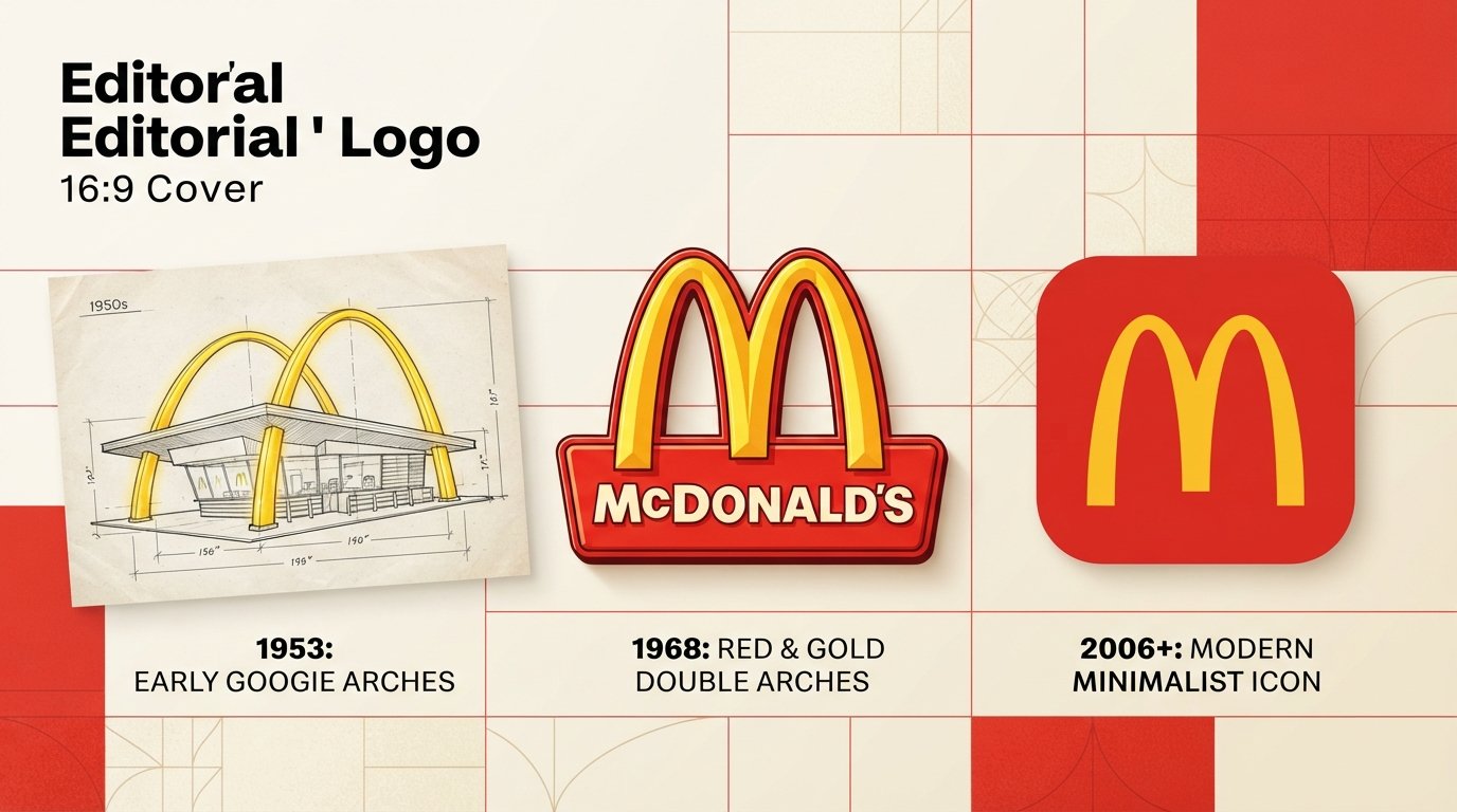
Quick answer: The McDonald’s logo is the Golden Arches: two curved yellow arches joined to form a capital “M,” usually set on a red background. The arches began as real 25-foot structures that architect Stanley Clark Meston built into McDonald’s restaurants in the early 1950s. Designer Jim Schindler turned them into a logo in the early 1960s, and the clean, unified “M” has been the core mark since 1968. The brand’s official colors are gold and red, and its custom typeface is Speedee.
Fast facts: the McDonald’s logo at a glance
| Question | Short answer |
|---|---|
| What is the logo called? | The Golden Arches |
| What does it look like? | Two yellow arches forming an “M,” often on red |
| Who designed the first arches? | Architect Stanley Clark Meston (with assistant Charles Fish), working from a sketch by Richard McDonald |
| Who turned them into a logo? | Jim Schindler, head of engineering and design (1962) |
| When did the modern “M” appear? | 1968 (refined from the 1962 version) |
| Official brand colors | Gold and red |
| Brand typeface | Speedee, a custom font by Dalton Maag (2018) |
| Is the logo a font? | No. It is a symbol; the font applies to the text around it |
| Has it changed in 2026? | No official change to the main Golden Arches mark that we could find; McCafé got a visual refresh |
What does the McDonald’s logo look like?
The logo is a bold, rounded, double-arch “M” in golden yellow. Think two parabolic curves that meet in the middle. On signs, packaging and apps it appears on its own or on a red field, often without the McDonald’s name at all.
That last detail matters. The current brand system deliberately lets the arches stand alone, a move design writers described as freeing the symbol from the wordmark. You can recognize it from a highway at 70 mph, which is exactly the job it was built for.
Why this logo is worth understanding
Most logos are drawn first and applied later. The Golden Arches ran the other way: the building came first, and the logo was the building’s silhouette, simplified. Two brothers in San Bernardino wanted a restaurant that worked as its own advertisement for people driving past, so they hired an architect to make the structure itself the signal. A decade later, the corporation turned that signal into a symbol that now needs no explanation in most languages.
That origin is why the mark is a standard case study in branding classes, and why this page exists.
The story: from roadside architecture to global symbol
1952–1953: The arches are a building
In 1952, Richard and Maurice McDonald needed a new building for their hamburger restaurant. They reportedly interviewed several architects before choosing Stanley Clark Meston, a Southern California architect who specialized in car-oriented roadside design. Richard McDonald brought a rough sketch of two half-circle arches. Meston and his assistant Charles Fish refined that into two 25-foot yellow sheet-metal arches trimmed in neon, called “golden arches” even at the design stage.
The first franchised restaurant with the design opened in Phoenix, Arizona, in May 1953. The style belongs to what historians call Googie architecture: space-age, eye-catching, built for the windshield.
The mascot era: Speedee
Before the arches became the logo, McDonald’s mascot was Speedee, a winking little chef with a hamburger for a head, tied to the “Speedee Service System.” He stayed in use until the company retired him as its logo around 1962.
1962: Jim Schindler turns the arches into a logo
As franchising expanded, the company wanted a more corporate, scalable mark. Jim Schindler, McDonald’s head of engineering and design, translated the architecture into a symbol. Accounts credit executive Fred Turner with an early sketch of a stylized “V” that Schindler extended into an “M.” The result showed the arches overlapping, with a slanted line representing the restaurant’s roof cutting through the middle, in gold on red.
Date note: some design histories say 1961, others 1962. Most sources, including the Wikipedia entry on the Golden Arches and Wallpaper, settle on 1962.*
1967–1968: The physical arches go, the logo stays
The company dropped the physical arches from nearly all restaurants in the 1960s, switching to a mansard-roof design. The arches survived anyway, and in 1968 the logo was cleaned up into the unified “M” without the diagonal line. That is the direct ancestor of what you see today.
1975 and the red backing
A red background was added in 1975, locking in the red-and-yellow pairing the brand still uses.
Early 2000s: Bolder and simpler
Around the launch of the “i’m lovin’ it” campaign in 2003, design histories note the arches became bolder and the red backing became optional, a shift toward a flatter, more adaptable mark.
2009: Green backgrounds in Europe
McDonald’s swapped the red backdrop for a deep hunter green in parts of Europe, with about 100 German restaurants changing by the end of 2009 and some in the UK and France already using it. The company framed it as an eco-friendly signal. Critics called it greenwashing.
2018–2019: The Speedee typeface and the “Archery” system
Turner Duckworth led a global identity overhaul, working with type foundry Dalton Maag on a custom typeface named Speedee (a nod to the 1950s mascot). The new system made gold the lead color with red as an accent, and treated the arches as a standalone symbol that can flex across packaging, screens and merchandise.
2022: Russia
After McDonald’s exited Russia, the business there was rebranded and unveiled a new logo that dropped the Golden Arches entirely.
2026: Where things stand
We found no official change to McDonald’s main logo in 2026. What did change: McDonald’s refreshed the McCafé visual identity, with a refined gold and coffee-cherry-inspired palette, ahead of a May 6, 2026 beverage expansion.
McDonald’s logo timeline (table)
| Era | What the logo looked like | Key detail |
|---|---|---|
| 1940–1948 | Script wordmark, no arches | Early barbecue-era branding |
| 1948–1962 | Speedee the chef mascot | Linked to the Speedee Service System |
| 1953 | Real arches on the building | Meston and Fish’s design, Phoenix |
| 1962 | Overlapping arches with a diagonal roof line | Jim Schindler |
| 1968 | Clean unified “M” | Diagonal line dropped |
| 1975 | Red background added | Red-and-yellow locked in |
| 2003 onward | Bolder arches, optional red | Aligned with “i’m lovin’ it” |
| 2009 | Green backgrounds in parts of Europe | Eco-image push |
| 2018–2019 | Gold-led system, Speedee font | Turner Duckworth and Dalton Maag |
| 2026 | Main mark unchanged | McCafé identity refreshed |
What does the McDonald’s logo mean?
There is no single official “secret meaning,” but four layers explain why it works:
- It’s an “M.” The arches double as the first letter of the name, so the symbol and the word reinforce each other.
- It’s architecture. The curve is a memory of the original roadside buildings. Even people who never saw the 1950s restaurants absorb that sense of welcome.
- It’s visible. Yellow is the most visible color in daylight, and the red-yellow pairing is widely used in fast food because it reads fast from a distance.
- It’s simple. Two shapes, two colors. It scales from a tiny app icon to a giant highway sign without losing legibility.
Official brand guidelines describe the gold as inspired by melted cheese and crispy fries, which tells you how the company wants the color to feel: warm, cheerful, edible.
McDonald’s logo colors (hex codes and codes for print)
This is where most websites quietly disagree, so here is both sets.
| Source | Gold / Yellow | Red |
|---|---|---|
| McDonald’s 2019 global brand guidelines | #FFBC0D (RGB 255, 188, 13) | #DB0007 (RGB 219, 0, 7) |
| Widely used brand-kit values | #FFC72C (Pantone 123 C) | #DA291C (Pantone 485 C) |
Which should you use? If you are producing something that must match McDonald’s own materials, work from the company’s current guideline. For editorial, school or design-study projects, either pair will read as McDonald’s. The 2019 guideline also warns against using colors other than gold for the arches, so stay true to gold.
What font does the McDonald’s logo use?
None. The logo is a symbol, not lettering. The font question applies to the brand’s text:
- Speedee is McDonald’s custom corporate typeface, rolled out globally in 2018.
- It was designed by Dalton Maag, comes in three weights (Bold, Regular, Light), and replaced the earlier Lovin’ Sans.
- It is proprietary, so you cannot download it from McDonald’s. A friendly rounded sans such as Nunito is a commonly suggested free lookalike.
- The 2019 guideline also says not to use the Golden Arches as a letterform, so avoid typing words with the arches as an “M.”
Are all McDonald’s arches golden?
No. There are famous exceptions:
- Sedona, Arizona: the only McDonald’s with turquoise arches, opened in 1993. City officials wanted the signage to blend with the red rock landscape, and McDonald’s first proposed turquoise, which was accepted. The city’s own staff have said yellow might have been accepted if the company had pushed for it.
- Parts of Europe (2009): green backgrounds behind the arches.
- Other special sites: some heritage and architecture-sensitive locations have adapted the colors.
Myths, rumors, and what is actually documented
“The arches were designed to look like a Freudian symbol.” A design consultant, Louis Cheskin, did argue that the arches had a subconscious pull on customers and should stay. But that happened after the arches already existed. The original arches were architecture, not psychology, so the popular “hidden meaning” story gets the sequence wrong.
“The arches are recognized by more people than the cross.” This line is repeated everywhere, but we could not trace it to a primary study. Treat it as marketing folklore, not a verified statistic.
“McDonald’s changed its logo to McDOalds.” This was a viral social-media moment tied to a TikTok creator’s redesign concept, not an official rebrand. McDonald’s did not announce a change to its logo or name. It is one of the clearest examples of how a logo can become content.
“McDonald’s dropped the Golden Arches in the UK.” Campaign stunts, from a question mark years ago to the Golden Eyebrows UK campaign, have temporarily swapped the arches. None replaced the logo permanently.
Can I use the McDonald’s logo?
The Golden Arches are a registered, heavily protected trademark. A few practical rules of thumb:
- News, review and educational discussion (like an article about the logo) generally treat the mark very differently from commercial use.
- Do not use it to suggest your product is affiliated with McDonald’s.
- Do not alter the arches, recolor them, or use them as a letter in other words.
- When in doubt, read McDonald’s brand and media guidelines or ask their press team before publishing.
This is general information, not legal advice. If you are using the logo commercially, talk to a trademark attorney.
If you’re a designer or founder who wants a similar level of simplicity for your own brand, make something original instead. Our guide to the best AI logo tools [add URL] shows how to build a clean, ownable mark, and our explainers on whether AI-generated images are copyright free and whether you can copyright AI art if you edit it cover the ownership questions you’ll hit along the way.
7 design lessons from the McDonald’s logo
- Start with something people already see. The arches were famous before they were a logo.
- Let the symbol carry the name. The “M” made the brand name implicit.
- Use two colors, then commit. Red and gold have barely changed in decades.
- Design for distance. The first job was catching drivers’ eyes at speed.
- Simplify as you scale. Each revision removed detail instead of adding it.
- Build a system, not just a mark. Speedee, the palette and the “Archery” rules keep every touchpoint consistent.
- Protect the core, play at the edges. Stunts like the Golden Eyebrows work because the base mark is rock solid.
Frequently asked questions
What is the McDonald’s logo called?
The Golden Arches. The phrase has become a shorthand for the company itself; McDonald’s China division was even renamed “Golden Arches” in 2017.
Who designed the McDonald’s logo?
The arches were designed as architecture by Stanley Clark Meston (with Charles Fish) in the early 1950s. Jim Schindler, McDonald’s head of engineering and design, turned them into a logo in 1962.
When was the McDonald’s logo created?
The arches date to 1952–1953. The first “M” logo came in 1962, and the unified version came in 1968.
What do the Golden Arches represent?
The letter “M,” the brand’s roadside-architecture roots, and a simple, high-visibility identity built around gold and red.
What colors are in the McDonald’s logo?
Gold (yellow) and red. Official 2019 guideline values are #FFBC0D and #DB0007; many brand kits list #FFC72C and #DA291C.
What font is the McDonald’s logo?
The logo is a symbol, not a font. McDonald’s text uses its proprietary Speedee typeface, introduced in 2018.
Who made the Speedee font?
Dalton Maag, as part of a Turner Duckworth-led rebrand.
Did McDonald’s change its logo in 2026?
Not the main logo, as far as we could find. The McCafé identity was refreshed in 2026, and viral social-media redesigns have circulated but are not official.
What was McDonald’s first logo?
Early branding was a script wordmark, followed by Speedee the chef mascot. The arches became the logo in 1962.
Why are the McDonald’s arches yellow?
Yellow is highly visible and communicates warmth and energy, and McDonald’s describes its gold as inspired by cheese and fries. The arches were also originally built as bright yellow neon-trimmed structures.
Why is the McDonald’s in Sedona turquoise?
Local officials wanted the sign to blend with the red rock landscape, so the arches were made turquoise when the restaurant opened in 1993.
Why did McDonald’s use green in Europe?
In 2009, the company swapped the red background for hunter green in some European markets to signal a more eco-friendly image.
Is the McDonald’s logo a trademark?
Yes. It is protected, and brand guidelines restrict how it can be altered or used.
Where can I download the McDonald’s logo?
For official use, McDonald’s brand and media resources are the right starting point. Avoid unofficial downloads for anything commercial.
The bottom line
The McDonald’s logo is proof that the best identity can start as something other than a logo. A pair of roadside arches became a letter, the letter became a symbol, and the symbol became shorthand for an entire company. Its staying power comes from three things: a shape you can read from a moving car, two colors that never wandered, and a company disciplined enough to simplify rather than decorate.
Sources and further reading
- Wikipedia: Golden Arches (history of Meston’s design and the 1962 and 1968 logos)
- Wallpaper*: “The story of McDonald’s legendary logo by Jim Schindler”
- It’s Nice That: “Behind the McDonald’s redesign: from the Speedee typeface to the Archery logo system” (July 2019)
- Fonts In Use: Speedee typeface entry
- McDonald’s 2019 global brand guidelines (colors, typography and usage rules)
- NBC News: “McDonald’s rolling out green logo in Europe” (2009)
- Fox News: “McDonald’s turquoise arches go viral but they were painted 20 years ago”
- Quartz: “The strange, Freudian design of McDonald’s golden arches”
- CulinaryLore: “Hidden messages in fast food logos: urban legends vs. reality”
- WARC: “McDonald’s: The brains behind the brows” (Golden Eyebrows campaign)
- McDonald’s Corporate: “McDonald’s refreshes McCafé brand visual identity” (2026)




[…] McDonald’s Logo: Who Designed the Golden Arches, What They Mean, and How They Changed (2026 Gu…By Tech Expert TeamQuick answer: The McDonald's logo is the Golden Arches: two curved yellow arches joined to form a capital "M," usually set on a red background…. Leave a Comment […]
[…] McDonald’s Logo: Who Designed the Golden Arches, What They Mean, and How They Changed (2026 Gu…By Tech Expert TeamQuick answer: The McDonald's logo is the Golden Arches: two curved yellow arches joined to form a capital "M," usually set on a red background…. 1 Comment […]
[…] McDonald’s Logo: Who Designed the Golden Arches, What They Mean, and How They Changed (2026 Gu…By Tech Expert TeamQuick answer: The McDonald's logo is the Golden Arches: two curved yellow arches joined to form a capital "M," usually set on a red background…. 2 Comments […]